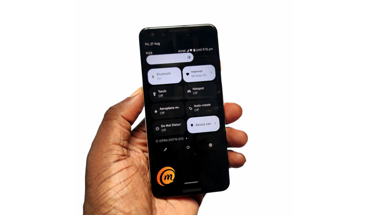
I never thought that I would ever say this, but here we are, and here it is: having used Android 12 beta for about a month now, I am in love with stock Android much more than ever. This is the most gorgeous version of Android yet, and it is so beautiful that almost every custom skin out there looks ugly in comparison. Take note that this Android 12 review focuses on the user interface of the OS.
I like One UI, but after tasting Android 12, I am not quite as excited about it as I used to be. My current driver is the darling Xiaomi Mi Note 10 Pro, and I have enjoyed the MIUI 12.5 experience for the most part. But even that now feels like a tepid experience since my encounter with Android 12.

Table of Contents
What Is The User Experience Of Android 12 Like?
If someone were to ask me to describe the user interface of Android 12, the ironic answer would be that it looks like Google took the best parts of One UI and the best parts of MIUI and merged the two to create a masterpiece. That is the impression that I get of stock Android 12.
For example, stock Android 12’s UI isn’t as colourful as MIUI’s. It is more demure, classy, and Zen-like. And it is certainly more flexible, offering a richer set of customization options.
What Do I Like About The UI Of Stock Android 12?
There are lots of things I like about it. I love the cool, calm, colour schemes. I love that the colours of the user interface can be themed to match whatever wallpaper I use. Basically, when you set a wallpaper, the operating system pulls complementary colours from it and uses those to theme the entire system UI of the phone. You can opt to use preset basic colours too, if you want. This is such a beautiful thing, and it reminds me of the glorious days of customization on Symbian OS.

Themed icons is another cool customiation feature that Android 12 brings to the table. If you enable it, the icons of installed apps on the phone are themed to match the colour style you picked for the UI. Personally, I don’t like the results that much, so I have chosen to keep this disabled. But it can and will likely produce better results, and it is great to have the option available.
I like that Android 12 has got rid of Bubbles and chat heads in the stock Google Phone app! Oh, those pesky intrusions on the screen couldn’t go away fast enough, and I am happy that Google is ditching them. Instead, they have been replaced with a chip that displays in the status bar at the top of the screen. Much better. One can only hope that app developers will follow suit as well. Facebook introduced it first, and hopefully they will ditch it too.
The new smart auto-rotate feature is a fabulous idea. Once I pick up a new phone, one of the first things I do is turn off autorotate. Having autorotate on means that every time I recline or lean while using my phone, the display dances and twists and turns. it is a mess. I am not sure how others manage to keep it one, as many in my circle do. But, heck! No.
Anyway, the new smart autorotate system employs the selfie camera to keep track of the position of the user’s head and automatically adjust the screen’s rotation to that. This is what I am talking about when I say smartphones need to get smarter. These damned things have to adjust to the user, and not the other way round, and smart autorotate promises that.
I use the word “promise”, because during my Android 12 beta experience, it didn’t quite work for me. I turned on the setting after it was first made available and autorotate was still turninoninown as it used to do. Then, the feature disappeared from my phone after another software update and has not been back since. No worries; this is beta software. I am looking forward to seeing it again, and working as promised, when Android 12 is pulled out of beta.
Android 12 Review: Conclusions
Android 12 is the biggest change to ever happen in the Android ecosystem in about seven years. The new user interface, Material You, is such a welcome delight. The lads at Google must have worked their butts off to pull this off. Everything looks, feels, and works better.
Android 12 has such a calm, fluid, and lighter appearance than ever before. While I have loved stock Android for years, I am so totally smitten now that it aches a bit just to think of using any phone with a custom Android skin slapped on it.
You will be interested in our recommended Pixel 6 and Android 12 tweaks.


It such a pity that Galaxy S9 won’t be getting Android 12😢😥